How to Use Flowcharts for Clearer Software Processes
- Arany Mák

- Jun 2, 2025
- 4 min read
Updated: Nov 8, 2025
Flowcharts. The word might conjure memories of stiff diagrams hidden in documentation nobody reads. But in the right hands, flowcharts are far from dull; they’re sharp, strategic tools for aligning minds, clarifying chaos, and streamlining software development. In technical communication, especially within software teams, flowcharts can be a game-changer when done right. Let’s dig deep into how and why.

Most developers and tech writers have a love-hate relationship with documentation. It’s essential, yet often neglected. Flowcharts, however, offer a way out of this paradox. They can visually communicate what paragraphs of text cannot: logic flow, system behavior, decision trees, onboarding paths, bug triaging routes, and even deployment pipelines.
But here’s the catch: most flowcharts are boring, inconsistent, or misleading. Why? Because they’re usually created as afterthoughts. A proper flowchart is not a visual aftershock of a written document. It’s a design tool. A storytelling device. A map.
Start here: Good flowcharts begin with purpose. Before opening any tool, define the “why.” Are you trying to explain a backend authentication flow to new engineers? Mapping the user journey through a mobile app? Outlining CI/CD processes for a cross-functional team? The purpose dictates the structure.
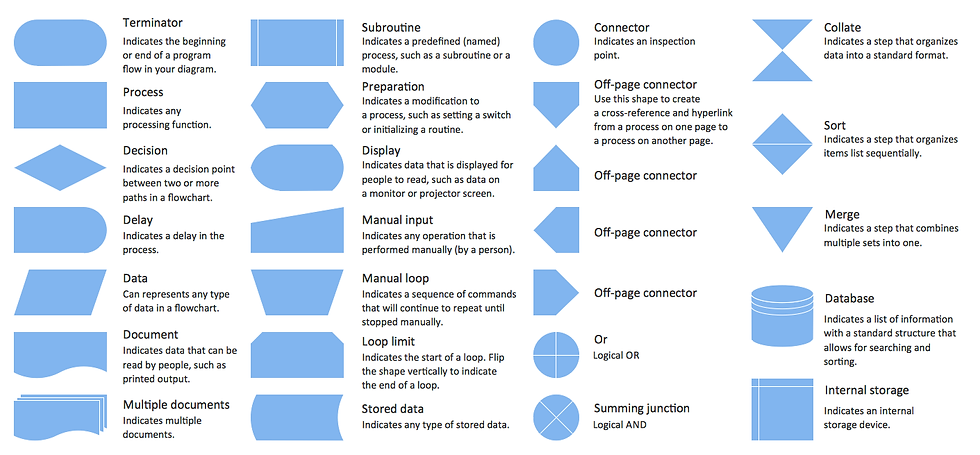
Now onto the building blocks: symbols. There’s no shortage of standard ones (oval for start/end, rectangles for processes, diamonds for decisions), but context matters more than conformity. For software teams, it’s better to be slightly non-standard but universally understood by your stakeholders than to be ISO 5807-compliant and cryptic. Custom icons, colors, or annotations can dramatically improve clarity if used consistently and sparingly.
Another pro tip: layer your complexity. Flowcharts don’t need to be monolithic beasts. Start with the 30,000-foot view—just the major steps or components. Then drill down. Link to sub-flows. Use tooltips. Embed them into wiki pages or documentation tools like Confluence or Notion with interactive capabilities. Tools like Miro, Whimsical, Draw.io, or Mermaid (for code-based diagrams) are brilliant for creating layered, evolving diagrams.
Let’s go practical. Here are flowchart use cases that most software teams overlook:
Incident Response Playbooks
Instead of verbose documents, show the flow. Visualizing this reduces the cognitive load during stressful moments.
What happens when an alert is triggered?
Who gets notified?
What are the possible scenarios and decision points?
API Request-Response Lifecycle
A single diagram can show how a user action in the UI becomes a cascade of backend services interacting. Include retries, error branches, caching layers, and third-party calls. This is gold for onboarding engineers and debugging conversations.
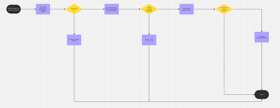
Feature Flag Control Paths
When flags conditionally render UI components or change logic, map them. It helps developers avoid “flag spaghetti” and helps product owners and project managers understand what’s actually live.
Git Workflow and Release Strategy
Rebase, squash, merge, cherry-pick, terms that confuse even mid-level devs. A flowchart showing how and when to use each can prevent a lot of Git pain. Bonus: Include conflict resolution paths.
User Support Escalation Paths
If your support system involves multiple roles (support agent → tech support → developer), map it. This helps developers understand where their input fits and ensures accountability.
Now, let’s address something rarely discussed: flowchart accessibility and readability. We live in the age of remote teams and asynchronous communication. Your diagram must be understandable even when you’re not there to explain it.
Avoid visual clutter. One screen = one idea. If your chart spills off the monitor, split it.
Use concise, consistent labeling. Action verbs (“Check token”, “Send request”, “Log error”) beat noun-based phrases (“Token check”, “Request sending”) every time.
Color with intent. Use color to group, prioritize, or indicate risk, not to decorate. For instance, red = fail path, green = happy path, blue = optional logic.
Test it. Run it past someone unfamiliar with the flow. If they can’t follow it in 60 seconds, iterate.
And don’t underestimate the strategic power of a flowchart in meetings. Presenting a logic flow visually often uncovers misalignments in assumptions across teams. What you think is obvious may be invisible to others until it’s diagrammed. The diagram becomes a neutral zone, where ideas get challenged, not people.
Also worth noting is the use of flowcharts as alignment tools for agile ceremonies. During sprint planning or backlog grooming, diagrams can prevent misunderstanding of how a proposed feature affects existing flows. Instead of debating hypotheticals, you can see the ripple effects.
And here's an advanced but underrated move: versioning your diagrams. Just as code changes over time, so does process logic. Store diagrams in Git. Markdown-based tools like Mermaid or PlantUML allow diagram-as-code, which means you can diff them, PR them, and track changes.
To summarize, a well-made flowchart is not “just a diagram.” It mirrors your system’s logic, a bridge across roles, and a low-friction way to document dynamic, collaborative knowledge. In a world where mental models are often siloed, visual communication is your most scalable weapon.
So, ditch the “documentation guilt,” embrace the visual edge, and start building flowcharts that aren’t just nice but necessary.
Feature Flag Troubleshooting Flowchart
Feature not working as expected

Copyright © 2025 Arany Mák Flag missing or not behaving as configured
Copyright © 2025 Arany Mák


Comments